Information is power wk. 2

On Tuesday we looked at storytelling and how we can visually show a number of important points that happened in certain events. We were put into groups and each given a news article on a different topic. Our group was given a news article on nursery school closures.
27152821_1495810313800336_1338467473_n

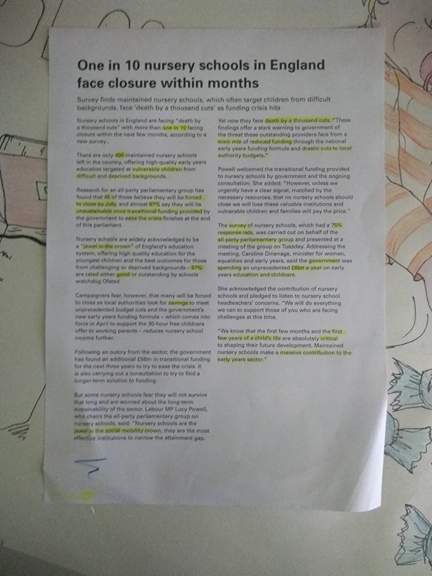
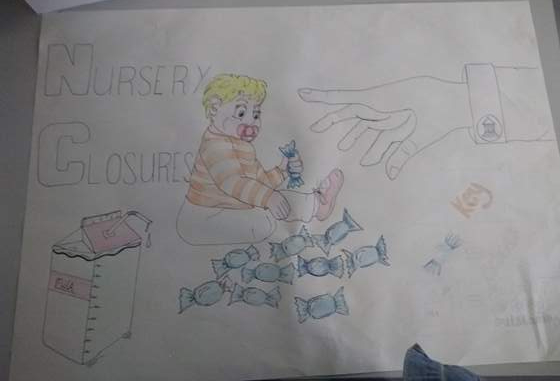
We read through the article and picked out the main points we wanted to illustrate. We learned that it was the government cuts that were closing the perfectly good schools so We then decided to illustrate a baby holding a sweet, the sweet represents the school so around the baby were nine sweets and the baby had the tenth, a government hand is then reaching out to take the baby’s sweet representing that one in ten schools are being taken away by the government. I feel like our poster was clear and well illustrated but in future, I would choose a few more points from the article to illustrate.
27045329_1495810350466999_696251993_n

During this exercise, I thought this would work well with my subject area of animation as I can take articles and stories that are relevant now and make animations from them. I feel like this would be a great way of raising awareness of situations around the world.

On thursday we had a presentation from Stephen McCarthy, a product designer from GOV.com On Thursday we had a presentation from Stephen McCarthy, a product designer from GOV.com he talked about how he helps design the GOV website to make it simple and easy for all users to use. They use illustrations and words that are universally regongnised. We learned that we must create things that everyone can use easily.
We were put into groups and given a 60-page web page on employment in the UK
We had to take some of the information and re-illustrate it so it was simple to understand and more interesting.
Our group focused on strikes in work and wether it works or not, we displayed this in a simple booklet form and discovered that striking does work as after the strike annual pay increased while the number of working days lost also increased. Interestingly, after the strike redundancy did not increase as expected.
In doing this I have learned that a lot of information can be condenced and projected in a more simple and effective way that can really grab people’s attention to the subject matter more.

Information is power wk.1

In the first week of this field project, we looked at different ways of displaying data, creatively, efficiently and effectively that is a visual representation of data that can express it’s meaning more clearly to the viewer.
We looked at Charles Minard, a French civil engineer who published a flow map on the subject of Napoleon’s disastrous Russian campaign of 1812. Using a two-dimensional image he was able to create a functional map representing several variables with aesthetic beauty. We were also shown the different ways that information can be displayed such as using animation as shown the video called “the seed” by Jhonny kelly where the information on a seed’s life/travels is displayed using simple animation.
The first workshop I was involved in consisted of every student answering questions individually. We were then sat in groups and were provided with one of the questions, the answers to this question then became our data. It was interesting to see how many people had similar answers. Our question was “If you were stuck in a lift, who is the one person you’d want to be stuck with?” most people answered with a family member, a loved one, a celebrity or “the lift fixer” for this we created three main categories, family and friends, celebrities and people of aid. Within these categories, we created subcategories such as blood relatives and chosen loved ones, UK celebrities, American celebrities and fictional characters, and practice/specific answers, not immediately helpful and generic answers.

27045155_1491246250923409_1397366862_n

With our answers categorized we created a data map using lines of different shapes and colours to represent each answer in each category. I feel like this idea worked well but it would be less complicated and easier to read if we’d had time to make a key. without the key it was difficult for other people to understand so in future I will try to make the designs less complicated. But with a clear key, I think the idea would work very effectively.
27043370_1491246254256742_2035109071_n

We were put into groups of three and were given the task of collecting our own data and making our own creative data map. We decided on the idea of comparing different radio stations and seeing the difference in advertisements, music playing and how often the presenters would talk. We all sat together for an hour and listened to a radio station each and write down whenever there was an advert or a song etc. We chose to listen to Heart radio, BBC 1 and KEXP, an American station for contrast. I chose to listen to Heart for the hour and I discovered that there were many adverts for different organizations playing and only half an hour of music in total. whereas, KEXP played more music for longer and had no adverts as they are completely independent. BBC 1 was similar to Heart but BBC 1 didn’t advertise other companies but they did constantly promote themselves.
After our data was collected we started to struggle with what we were trying to say with our data. We were thinking about the original purpose of the radio which was to announce the news and how we don’t hear the news anymore and all we want to hear is music without ads, but we were not sure how to show this visually.

Finally, we decided to show the personality of the stations using logos on three posters. we put a spam stamp on heart radio because it’s full of adverts and also made the title very interrupted. We drew a coffee cup with glasses to show the hipster vibe of KEXP and a loudspeaker to show the obnoxiousness of BBC 1.

after some feedback, we realised that we spent too much time on the logos we didn’t display the data efficiently. I have learned that I need to make sure the data is displayed and I need to make sure that I know what I want to say or get across with the data i’ve collected.

Space is the animated place wk5

This week we took one movement cycle from our animation, the lion turning into a mouse, and used stop motion to film the sequence in various places around the CSAD building. I realised that it was difficult to remember the sequence of the animal cutouts and also that moving the camera and keeping the cutouts and camera central was also challenging. We also used time-lapse to document the drawing process and cutting out of one of the lions. I believe this worked out very well. We also added the effect of filming the lion coming up from the paper from 2D into 3D. I feel like this worked well but it could be improved by taking more images of the process.

Space is the animated place wk.3/4

During the next two weeks, we experimented in the animation room with the cutouts. We decided to focus on a run cycle where the character turns into different animals, more than a narrative. Our transitions worked quite well and I am pleased with the process so far.
In the last week of field we are just going to focus on using one cycle from the animation which is the mouse turning into a lion. We are going to take this animation into the school itself by animating this motion in different areas around the school.

Space is the animated place. wk 2

In the second week of field. We came up with individual ideas about making our own animations. We then discussed our ideas within a group.

As the brief said we have to look at the spirit of the CSAD, I decided to focus on the spirit of a student in the school. I decided to morph the character into different animals depending on the emotion the character is feeling. For example, when the person gets scared they turn into a mouse.
I worked in a group with one other to create the characters, I decided to use the same technique of using cut outs of drawings as we did in the first group activity in Field.
24650707_1449101418471226_364961185_o

Space is the animated place

In the first week of my field project, space is the animated place, we looked at different techniques used in animation to morph characters into other characters. We looked at a scene from Disney’s The sword and the stone to see the different techniques used by Disney to transform characters.
As a group project, we were put into groups to create an animation, my group had to create an urban-themed animation using a wooden man to create a walk cycle. We created a night and day backdrop of city buildings. I created animations of a fox to run into the scene. In the night scene, the man turns into a werewolf, I was in charge of drawing the werewolf.
I found this group activity very enjoyable and it enabled me to understand how to use stop motion and experiment with different techniques using the characters. I learned how to create a short stop motion film and how to create the cutouts to use as characters. As well as this I also discovered that stop animation is a lengthy and sometimes complicated process.

Wooden Creatures

I have started to gather scraps of wood and place them together to create abstract, animal like shapes that leave room for the imagination. I plan to make more of these experimenting with paint and patterns and different materials. I enjoy making these creatures as I never know what it’s going to turn out like. These sculptures were developed from the field work I did within my group on the Texplore watch. I have taken the animals and logo from the watch and created these abstract animals.

After starting with just plain wood I then decided to use block colours to decorate my sculptures, using both bright colours and earth tone colours. I then started to paint different patterns and designs. After this, I started to use materials such as felt fabrics and feathers. This idea was also influenced by Salvador Dali’s work as his work is very dreamlike and left for the imagination. It was also influenced by the work of Piet Mondrain I have used the effect of using back outlines to make the colours stand out on my sculptures

.piet mondrain


Field Collaboration Project

For my field project I am working in a group of five people all from different subject areas to create a project that would attract potential backers. As a group we have decided to take inspiration from the talk “Into the woods” and decided to produce a project designed to get children outside and use technology in a positive way other than staying in on ipads, phones, laptops etc. all day. Together we have decided to create a wrist watch that scans different wildlife from the woodlands and turns them into characters once you’ve collected them. They can then use an app on a ipad or phone to play with their characters. Children will also be able to trade the things they find with other children by “bumping” their watches together. The watch will also contain a safety feature so if the child wanders too far from their parents then the watch will light up telling them to return to their parents.

field ideasfield ideas 2field ideas 3 
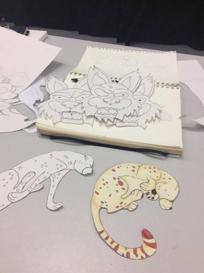
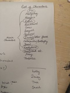
We have chosen 4 main characters from our list of wildlife (see above) including a squirrel, Daisy, tree and a snail. We chose these because we feel these will be the easiest to find to start the children off.

We also have to create a video showing the process of how it works and how it’s made etc. and also to sell our product to potential backers.

I am really enjoying this project and feel like we work well as a team. I like the fact that we are all from different subject areas and I have the opportunity to learn things from them that I didn’t know how to do before. Also this means we have different ways of working with things so together we make the perfect team.

At the end of the field project we worked together to create a small advertisement video for our Texplore watch.

Field-Future Generations

For the future Generations Conference, I went to the talk called Into the Woods. After going to this I have thought of the idea of using technology to get children outside by possibly combining technology with nature. Children are so transfixed on phones, I pads, Laptops etc, that they are missing out on an important part of their lives. Their childhood is being taken over by technology.

I have chosen to collaborate with Bethan Cook as her idea was that how technology is effecting our well-being. I feel like my idea and her’s would work well together as the well-being of children using technology and not going outside is also important. Working together we created work in different media to demonstrate our ideas.

We created a sculpture of a pinata on a tree bursting out with mobile phones instead of sweets. This I think can symbolize the children’s childhood being taken over by technology. This idea is also shown in our painting along with Bethan’s idea that technology is a necessity. Her painting shows children struggling and trying to help each other reach their phones in the tree. I believe this explains that people are determined and addicted to technology and can’t possibly be without it. I have drawn using charcoal, two children sitting by a tree hunched over their phones, completely ignoring the nature around them as they are so transfixed on their phones.